Forms
Forms provide a way for a user to easily interact with N2 applications.
You can find more information about Forms here.
Overview
Rules Of Thumb
General guidlines for form structure.
Forms should be simple and easy on the eyes.
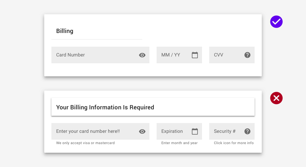
Input width should reflect the expected user input.
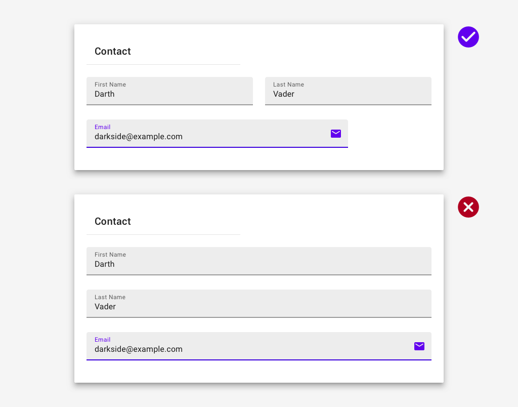
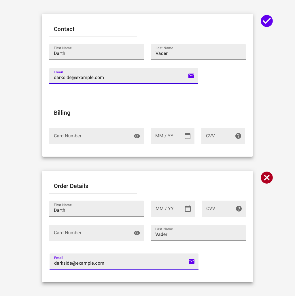
Related information should be grouped together.
A Note on Labels
The
<label>
tag is both extremely useful and important when it comes to building a
form.
When properly implemented, the
<label>
tag provides:
- Focusing/Activating input through gestures or clicking the label.
- Improved experience for those who are visually impaired (screenreaders).
If you are using the rails helpers demonstrated below, this is already done for you!
If you are using React or basic HTML for an input, you have two options:
-
You can embed the input in a
<label>tag.<label> Does this make sense? <input type="checkbox" name="inputName"/> </label> -
You can use
<label>'sforattribute. (Or in React,htmlForbecauseforis a reserved word in Javascript)# The "for" on label and "id" on input must match. <label for="inputID"> Does this make sense? <input type="checkbox" name="inputName" id="inputID"/>
API & Demo
To utilize this streamlined form builder that is error handling:
= form_for :resource, builder: MaterialForm do |f|It can be utilized with form_with to create forms with or without an ActiveRecord model backing it:
= form_with url: resource_path, local: true, builder: MaterialForm do |f|To set the color for all form inputs, pass it as an option.
= form_for :resource, builder: MaterialForm, color: :cyan do |f|
Disabled fields of most types are not design-approved. Instead you should use the
field_with_default_value
helper and pass in the `readonly` option.
= form_for @object, builder: MaterialForm do |f|
  # editable select with the list of states
  = f.select :state, states
  # readonly text field instead of a select
  = f.field_with_default_value :state, readonly: true
To make fields disabled based on policy, define read_only predicate methods on
the object passed into a form, e.g.
read_only_field?
for the
field
attribute. If the field is a checkbox, checkbox collection, or individual radio button, it will be disabled.
Otherwise, it will display as a read-only text field.
= form_for @object, builder: MaterialForm do |f|
  = f.text_field :name    # read-only text field if @object.read_only_name? is true
  = f.text_field :address # read-only text field if @object.read_only_address? is true
  = f.select :state, states # read-only text field if @object.read_only_state? is true
  = f.checkbox :local # disabled checkbox if @object.read_only_local? is true
  = f.radio_button :main_address # disabled radio button if @object.read_only_main_address? is true
  = f.collection_check_boxes :times, times # disabled checkboxes if @object.read_only_times? is true
= form_for :resource, builder: MaterialForm, color: :cyan do |f|To configure default options for all forms in an application, configure with an initializer:
MaterialForm.configure(color: "lime")