Page Structure
Consistency between N2 applications is essential to creating an engaging user experience.
You can find more information about Page Structure here.
Overview
When a client uses one of our apps, the app should feel intuitive and familiar. Having a consistent page structure and predictable components helps to accomplish this.
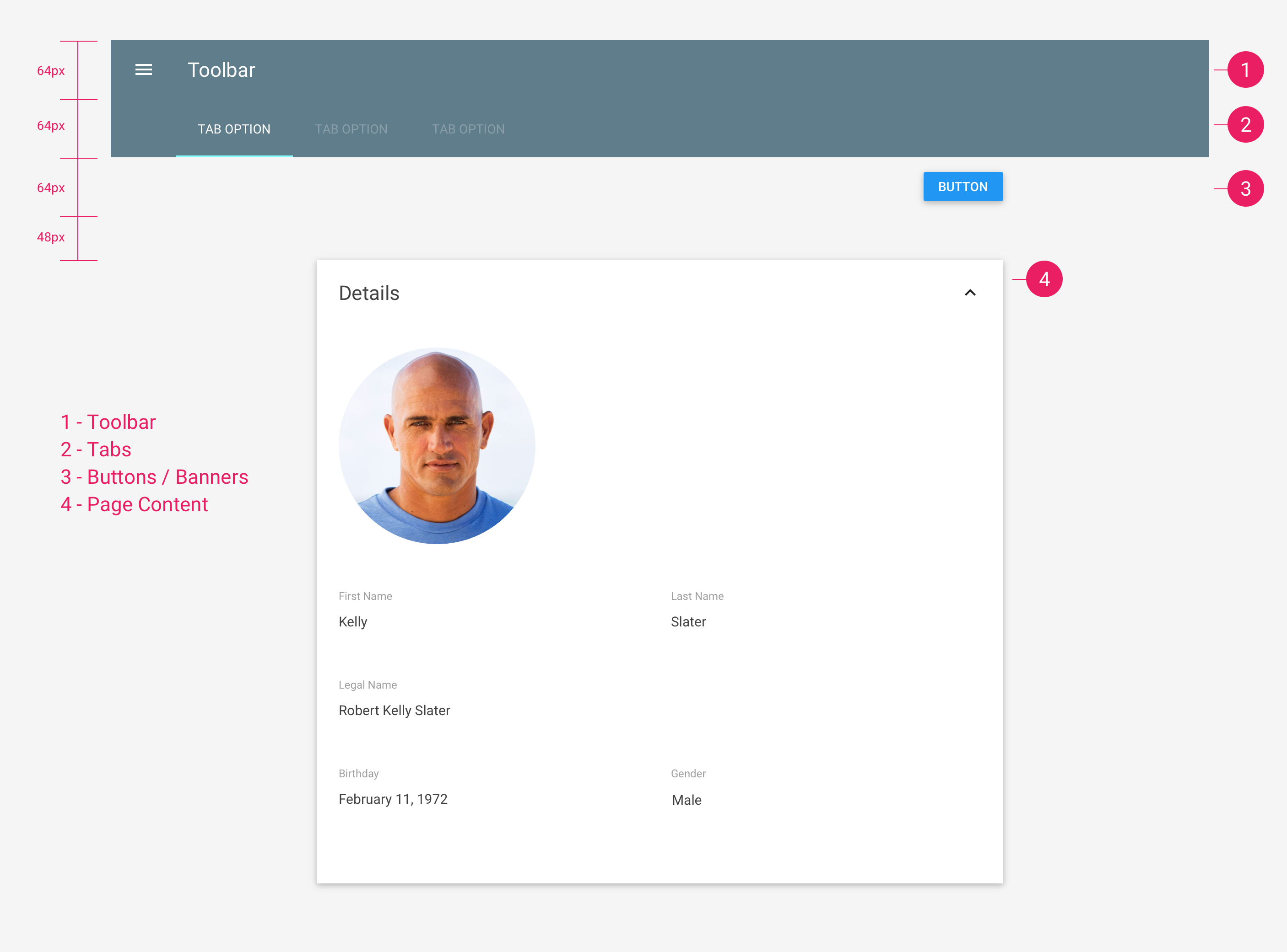
Toolbar
The Toolbar is always the first component on a page. It is always
64px
in
height and is the primary source of navigation on an application.
You can find more information about Toolbars here.
Tabs
Tabs, if needed, are always directly underneath the primary Toolbar. They
are also
64px
in height and are typically used to navigate content on the
current page.
You can find more information about Tabs here.
Buttons/Banners
Buttons and Banners are always directly underneath the Toolbar unless Tabs
are present. This space is also
64px
in height.
It is important to note that Banners should cover up the primary buttons as they typically require an action to dismiss them.
You can find more information about Banners here.
Page Content
Whether or not Tabs or Buttons/Banners exist, there should always be
48px
of additional space between the last header element and the page content.
64px
48px
Example Content
Lorem ipsum dolor sit amet, consectetur adipisicing elit, sed do eiusmod tempor incididunt ut labore et dolore magna aliqua. Ut enim ad minim veniam, quis nostrud exercitation ullamco laboris nisi ut aliquip ex ea commodo consequat.